


An Easy Guide to Pattern Mixing
Four ways to take pattern-packed looks from chaotic to charismatic.
One of my favorite fashion writers is Jenny Walton, not because our closets are cut from the same cloth, but because she embodies a sense of style that is so vastly different from my own. Where her style is vintage, mine is contemporary. Where hers channels Audrey Hepburn circa 1959, mine takes notes from ’80s menswear. Where hers is a patchwork of pattern, mine is mostly solid and neutral with the occasional pop of color.
Last May, she penned an article on the subject of pattern mixing, and I was immediately intrigued. I consider myself fairly adventurous when it comes to wearing exaggerated silhouettes and offbeat accessories, but give me a print that’s anything other than (1) small in scale or (2) a simple stripe, and all sartorial bravery leaves my body. You can imagine, therefore, that the idea of combining multiple patterns has historically made me want to run for the hills, but leave it to Jenny to convince me that a seemingly daunting way of dressing can be a wonderfully satisfying styling challenge.
In an effort to continue expanding my styling repertoire, I’ve been experimenting with pattern mixing over the past few months, and I’ve learned that it’s not an exact science—more alchemy, less chemistry. Finding a harmonious pairing sometimes requires swapping a piece or two. In other words, if you’re a beginner pattern-mixer like me, I wouldn’t attempt this process on a hurried morning, but I encourage you to take a stab whenever you have a few extra minutes and crave some creative stimulation.
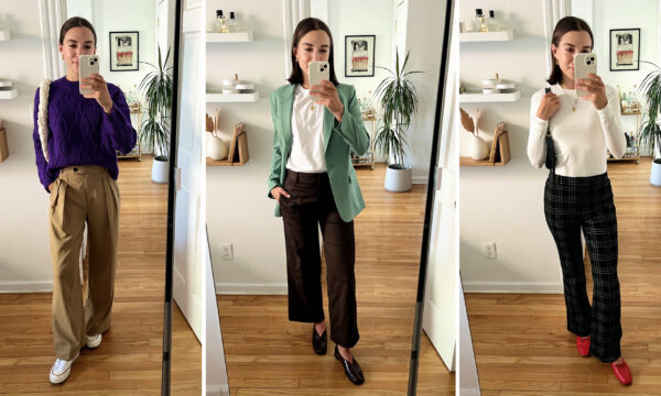
Before you go forth and embrace the trial and error of it all, scroll to see four rules of thumb I distilled from my dalliance with pattern mixing—plus “before” and “after” looks that illustrate these principles. As with most things in life, it’s all about balance.
Shop all the looks from this story here.
Disclaimer: I think it’s obvious when two prints glaringly clash, so to help you better understand the nuances of pattern pairing, I put together “before” looks that almost work. The “after” looks are simply more optimal pairings, in my opinion.
Want more M Dash?
Sign up for our weekly newsletter.
Thank you!
Guideline #1
Don’t Pair Bold on Bold

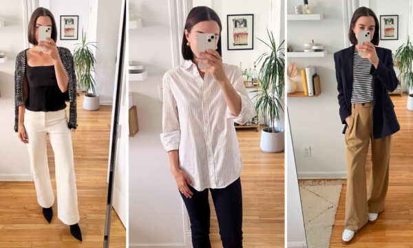
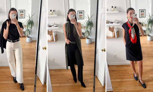
The first theme that stood out to me during my pattern-pairing journey was scale. The combinations I put together that involved two relatively big patterns almost always felt too loud, but once I swapped in a finer-print piece, the look would instantly become more digestible. For instance, I found that the muted hues of our new splatter pop Jett tank jive well with the dark, streamlined plaid of the O’Hara blazer, but together, these larger prints verge on overwhelming. In place of the Jett, I tried swapping in my kaleidoscope print Axam turtleneck, which offers just as much visual texture but serves as a nice counterbalance against the large-scale plaid thanks to a more sparse, speckled effect.
Guideline #2
Incorporate Negative Space

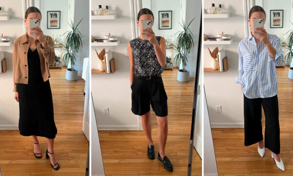
In the same way that mixing two bold patterns looks overwhelming, combining two small-scale patterns can appear busy. As you can see here, I wanted to style the mini check Milo jean, which features a teeny tiny plaid made up of orange, brown, and navy stripes. While this palette coordinates well with the rusts and browns of the Kiko cardigan, I found my eyes bouncing back and forth between the two patterns, not quite sure which to focus on and feeling like the look could be a bit cleaner. To achieve this, I chose a piece with more negative visual space: the Mila button-down in poplin stripe. It’s mostly white, meaning it goes with nearly anything, and its fine light blue stripe gives the outfit that extra element of pattern.
Guideline #3
Stick to One Colorful Piece

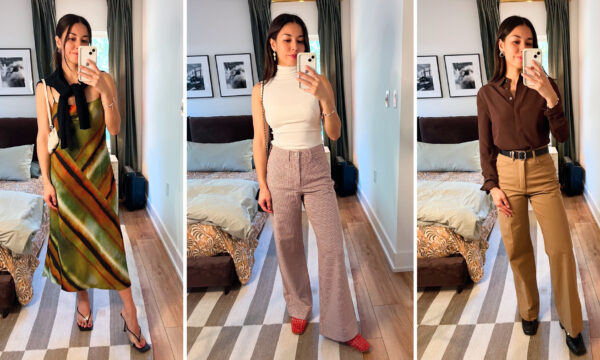
Attempting to play with both pattern mixing and unexpected color combos is a surefire way to visually overload your outfit. For example, the mini check Rhoda jacket—featuring stripes of orange, brown, and navy—works with the picnic check Peggy top palette-wise, but these color-packed plaids end up looking a bit busy when paired together. As a substitute for the Peggy, I layered the Sahara print Lisey camisole underneath the jacket, which fades into the background a bit more and still provides that pop of chocolate brown for a distinctly fall palette. This was also a reminder that, in general, mixing the same category of pattern (e.g. plaid) often competes in an unfavorable way. In contrast, a more organic pattern—in this case, leopard print—offers a beautiful counterbalance to check print’s clean lines.
Guideline #4
Create Balanced Proportions

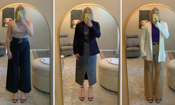
Last but not least, selecting the right proportions is another form of balance you want to strike when pattern-pairing. If you’re wearing a printed mid-length dress—such as the Priya I’m wearing here—I recommend choosing a layer that minimizes the amount of patterned material you have on your frame. If I were wearing a solid black dress, I would love the way the oversized plaid O’Hara blazer looks, but combined with a patterned dress, it comes off a bit sloppy. A more ideal silhouette here would be a cropped style like the Lilia jacket, which offers bonus texture without overwhelming the dress.
Shop all the looks from this story here.