Color Your World: 4 Ways to Play With Color for Spring
April 12, 2019 | Filed in: Your Closet
You love your dark, dependable solids. We know you do, because you’re still wearing them in the middle of April. We feel you—it’s hard to let go of something that works. But we’re here to usher you out of darkness on your way to a brighter world. Here are four ways to play with color for spring, featuring looks from our upcoming collection,Take the Stage (coming Tuesday!).
Tone-On-Tone
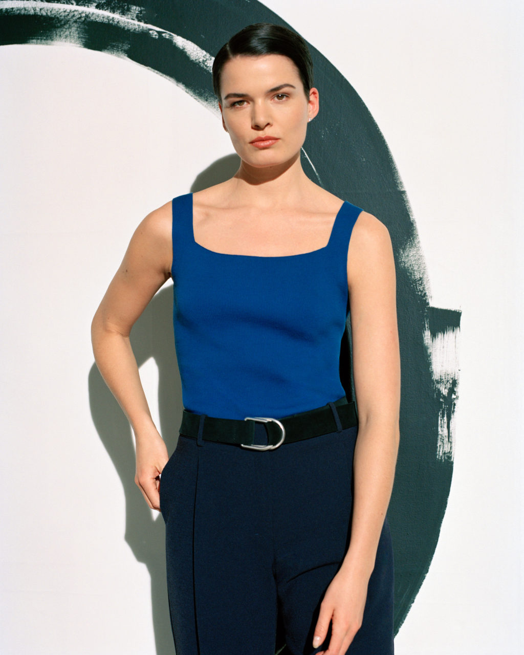
The Rio top in santorini, the Elliott trouser in galaxy blue, and the D-Ring belt (coming soon!).
Thoughtfully done, monochrome dressing—one shade, head to toe—is super chic. Whether you choose classic gray or navy, a bright red, or a soft camel, you can keep it interesting by varying the shades. Yep, you don’t have to match. You create visual interest when you let “off” pieces blend, as long as you stay in the same color family. This approach also breaks up your look, which gives your body more definition (hello, waistline!).
A slight but essential digression: While you’re blending shades, blend fabrics, too. Your look gets more luxe when you put differing textures together in unexpected ways, like a ribbed knit sweater with a smooth, silk skirt, or sleek twill pants with a tweedy jacket. Oh, and one more thing: Bring in interesting details like pleating or oversized pockets. Finish with a hint of shine (jewelry, a belt buckle, even a patent shoe) and, voilà!—perfection.
Color Blocking
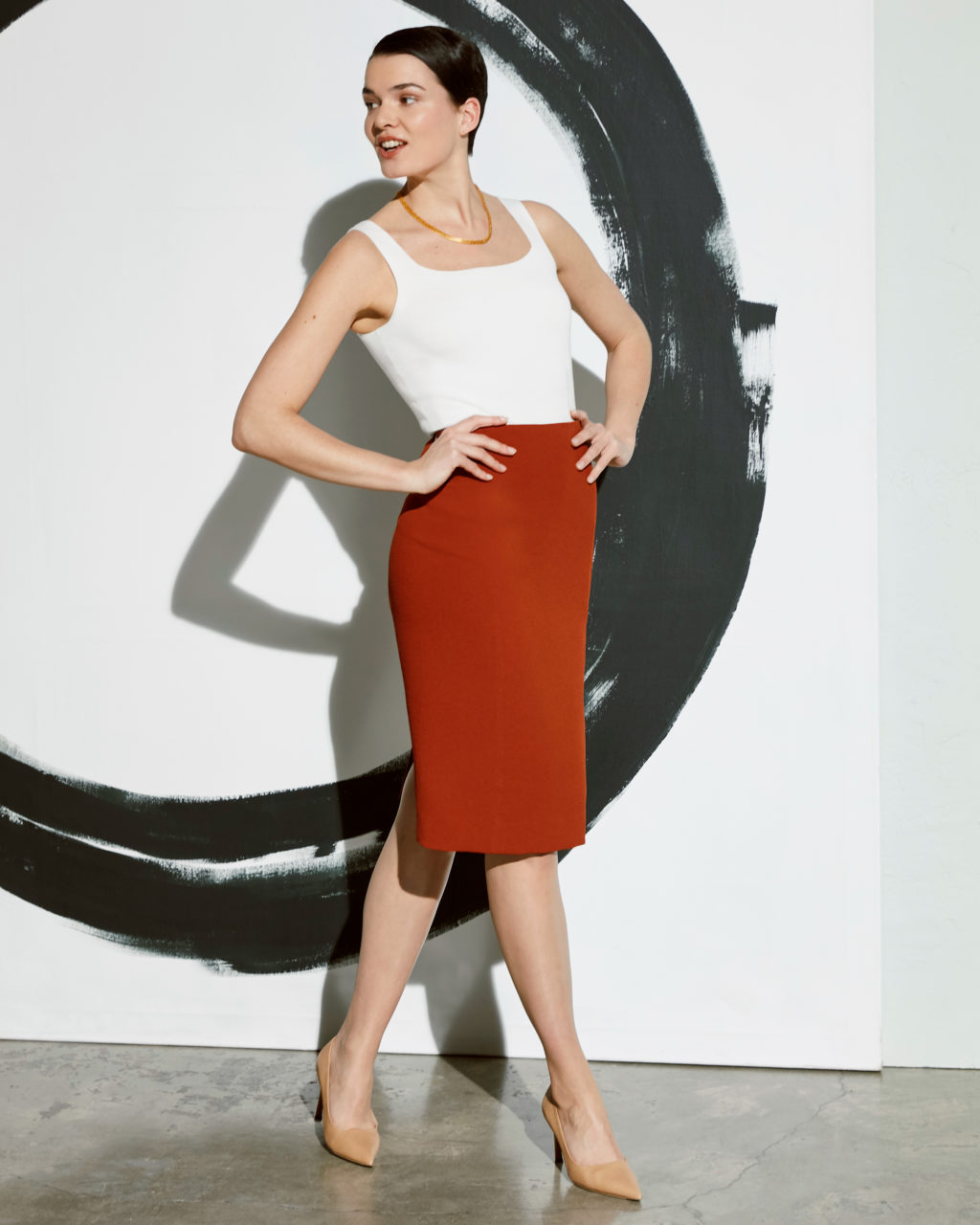
The Rio top in ivory, the Dorchester skirt in adobe, and the Ginger pump in wheat (coming soon!).
The idea here is to build your look with contrasting solid colors. It’s a graphic approach that can read either bold (when the colors are vibrant) or subtle (when they’re muted). Color blocking is a great way to bring in color without having to resort to prints. It also allows for creative color play since there’s no real way to go wrong. Navy pants with a gray top and mustard shoes? You bet. A black dress with a burgundy jacket and cobalt pumps? Absolutely. Using color near your face is extra-effective, brightening not only your mood but, when the color reflects in your cheeks, also your complexion. Looking for a rosy glow? Try a peach-colored blouse. When opting for a color-blocked look, skip the baubles and go for a simple hit of shine (say, silver hoop earrings).
Pattern Play
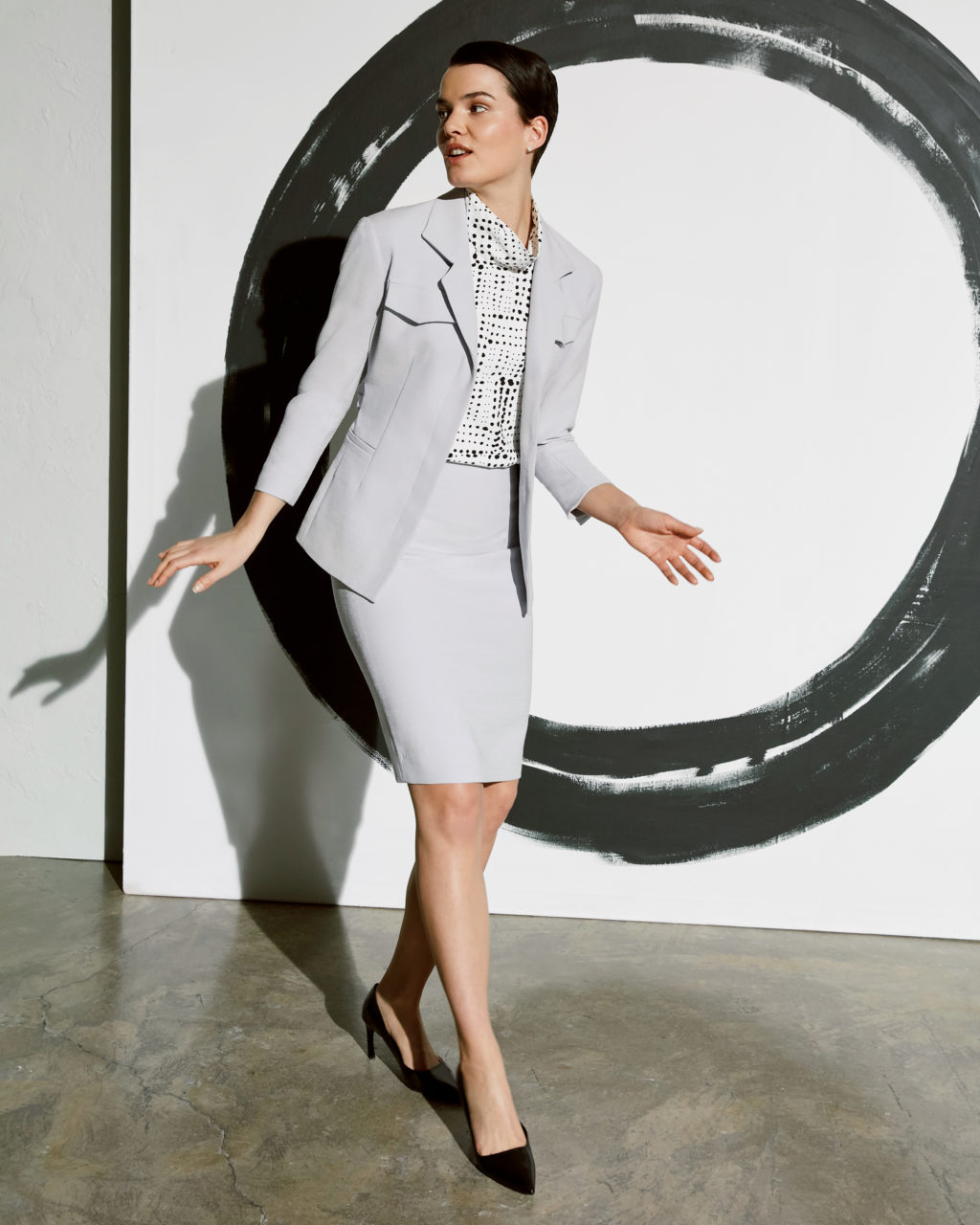
The Emalis jacket in pewter, the Lise top in dot print, and the Cobble Hill skirt in pewter (coming soon!).
Incorporating pattern requires an eye for marrying colors. The dominant color in any print you choose should be found elsewhere in your look (wearing a navy geometric print top with a navy bottom, for instance). Choosing a print in a palette with just two or three colors will keep your look focused, not fussy. Scale should also be considered: We’re all for large prints—they pack a style punch—but be mindful of where you put them (not on your largest part, we suggest). Also know that prints can be wonderfully camouflaging—a small-scale print can create visual shrinkage if that’s what you’re after. A print blouse can have a minimizing effect on your bust line. Still feeling pattern-panicked? Try it on a scarf or shoe (fun!).
Accent Color
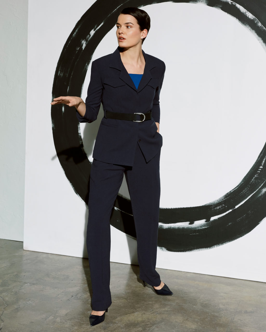
The Emalis jacket in galaxy blue, the Rio top in santorini, the D-Ring belt, and the Elliott trouser in galaxy blue (coming soon!).
Is your closet full of inky solids? Proceed gently but with determination. Using color as an accessory, say on a bold bag or a bright belt, is a great way to ease into the kaleidoscope. How to choose the right color pop for you? Your personal favorite always works, but let’s also make the case here for experimenting with the color of the moment, like turmeric or cerulean. There’s minimal risk—whatever it is, there’s just a bit of it, and you can always pass it along if you don’t love it.
Ready to add some color to your wardrobe? Keep an eye on your inbox for our new collection, Take the Stage, coming Tuesday!

